
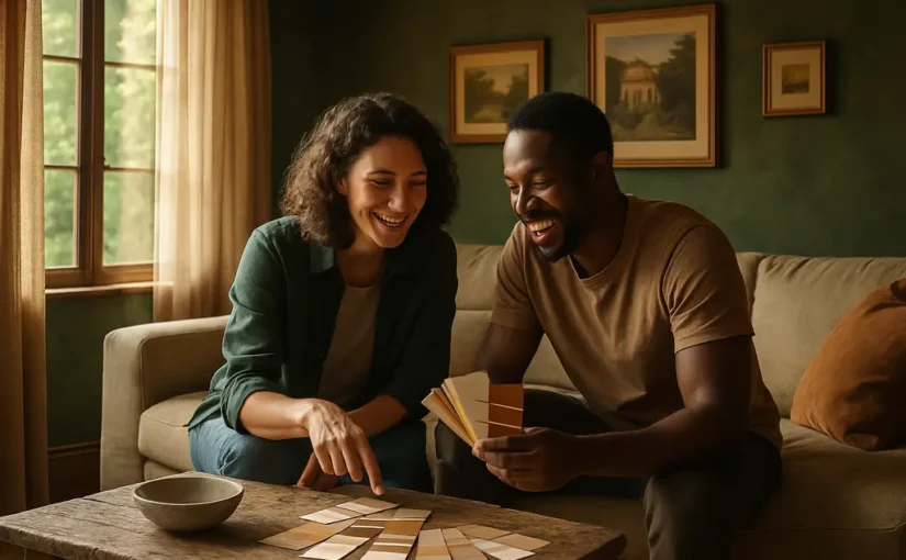
earthy tones extend beyond simple aesthetics, indicating a preference for interiors that are both unique and harmonized with nature. Recent trends show homeowners gravitating towards colors that offer more than just visual appeal; these tones support personalized, reflective spaces that resonate with individuality and comfort. The current data on 2026 interior color preferences highlights this movement, providing invaluable insights while emphasizing that trends should be thoughtfully interpreted and integrated.
Why Earthy Tones Signal Personalization
The shift away from stark, minimalist gray interiors is well-documented in design studies. In a revealing November 2025 report from Fixr, 66% of surveyed designers predict that restorative greens would be prominent in 2026 interiors, followed closely by nature-inspired neutrals at 59% and rich browns and khaki at 56%. This movement away from impersonal tones in favor of colors that exude warmth and personality marks a significant step towards personalized design. Nearly all participating experts (93%) anticipate the decline of cool, blue-toned grays which were previously dubbed “Millennial Gray,” favoring the comforting presence of earthy hues.
What The 2026 Color Data Shows
Behavioral data aligns with these predictions, as search trends reflect an increasing interest in such colors. According to a May 2026 report by Houzz, there was a remarkable 178% increase in searches for “rust colors,” with “chocolate brown” trailing closely at a 153% rise. Softer neutrals like “mushroom,” “sage,” “taupe,” and “cream” also saw increased interest, reinforcing the preference for naturally derived shades.
The transition reflects not just color preferences but a deeper yearning for spaces that feel curated and authentic. Such colors often harmonize with existing elements in a home, such as wooden flooring, stone countertops, and softer furnishings, resulting in a cohesive, yet personalized environment. However, even popular colors should be considered in the context of each individual home’s characteristics.
Why Warmer Neutrals Feel More Individual
Incorporating warm, earthy tones supports personalization because they naturally sync with many architectural elements and finishes in existing homes. Unlike the monochrome coldness of gray palettes, earthy hues such as terracotta, mossy greens, and warm taupes can enrich the character of a space without overwhelming it. Such tones echo the craft and texture found in natural materials, promoting a sense of harmony and connection. When set against organic textures such as wood grain or stone, these colors become complementary rather than competing choices, allowing residents to establish uniquely intimate and restorative spaces.
Choosing A Palette That Fits Your Home
Creating a personalized palette begins by evaluating the elements that define your space. Consider the permanence of large-scale items such as flooring, countertops, and fixtures when narrowing down color options for walls and furnishings. Since paint is one of the easiest elements to modify in an interior, its selection should enhance the existing features of your home rather than vie for dominance.
Using Earthy Tones Without Overcommitting
Introducing earthy tones through less permanent elements allows for greater flexibility. Walls, textiles, and accessories provide an experimental avenue to explore and refine your personal palate without the permanence that a kitchen island or cabinetry might require. Opt for easily replaced or updated items, especially if you’re renting or know changes may need to fit potential resale expectations. Use caution when applying strong colors comprehensively, as contrasting elements might eventually require substantial changes if tastes evolve.
Test Light, Finish, And Existing Materials
Colors react differently under varying lighting conditions; therefore, extensive sampling is advisable. Utilize sample boards instead of swatches when observing how colors might interact with light and existing design elements throughout different times of the day. Consider the type of finish; matte finishes can soften colors but reveal imperfections, whereas satin or semi-gloss finishes may withstand household wear yet highlight potential flaws.
DIY Paint Choices Versus Professional Work
For homes being screened for minor projects, embracing DIY painting with these tones can be both practical and rewarding, provided you maintain safety standards and understand constraints. While personalization is exciting, it’s essential to differentiate between tasks that can be pursued independently and those best handled by seasoned professionals, especially where safety, quality, or structural concerns are involved.
Safe DIY Scope
When considering a DIY project, keep efforts reasonable and the scope within manageable bounds. Projects should be straightforward and within reach, especially if they involve low-risk environments like accessible, sound walls or single-room transformations.
- Safe DIY initiatives: Trying out sample paints, updating soft furnishings, or altering fixtures and lamps within their functional boundaries.
- Exercise caution: Tasks like painting ceiling areas or working with unknown existing layers that may contain hazardous materials.
- Professional requirements: Changes affecting electrical fixtures, significant plumbing, or potential structural modifications.
When To Hire A Professional
Professional intervention is advisable for high-detail projects, precise finishes, and transformations involving risky or expensive materials. High ceilings, extensive trim work, and cabinets often necessitate experience and equipment beyond the average DIYer’s toolkit. Structural paint jobs also benefit from an expert who can correctly prepare surfaces like those needing specialty primers or consistent curing time, as in cabinet or detailed trim labor. For such undertakings, consulting with professionals who are well-versed in achieving polished results without compromising safety or material integrity is a sensible course.
Cost, Resale, And Project Planning

Decisions around color choice should also accommodate budgetary boundaries and how alterations might affect future value. Earthy tones, when implemented thoughtfully, can lend a welcoming vibe to a home without necessitating costly overhauls if integrated carefully.
Changes to existing palettes should consider themes of permanence vs. flexibility, such as reminding homeowners to plan these alongside conversations about long-term property goals, especially if significant investments are being made. When exploring ways to financially navigate significant remodels, it may be helpful to consult resources shared at Jimmy Guthrie Real Estate LLC for a complementary perspective on local market values, keeping bubble realities separate from the direct lived experience.
Spend Where Color Is Hard To Reverse
Prioritize investing thoughtfully in areas where color permanence will be a lasting determinant of your environment’s sentiment. A swiftly swapped decorative item offers more flexibility than a comprehensive tiled splashback or full-scale cabinetry. Introducing color gradually until you establish confidence can prevent larger missteps that might necessitate significant interventions to revisit established design boundaries.
Keep Samples And Records
By maintaining accurate records of all decorating choices, including paint samples, fabric swatches, and finish tags, homeowners can streamline maintenance tasks and achieve consistent upkeep over time. These detailed documenting practices can significantly ease future painting or furnishing efforts, where resembling prior conditions is desirable for both aesthetic consistency and broader market compatibility.
Earthy Tones As Personal Design Choices
Ultimately, choosing earthy tones reflects an enduring drive toward making homes feel representative and sensitively attuned to personal needs and characteristics. While these warmer, nature-infused tones can align a household with current sentiment and appeal, it’s crucial to navigate these preferences thoughtfully, ensuring they accommodate the dynamics of the existing space and the practicalities of day-to-day functionality. Viewed as a design consideration rather than a fleeting novelty, these hues promise a more enduring and invested sense of personalized style.