
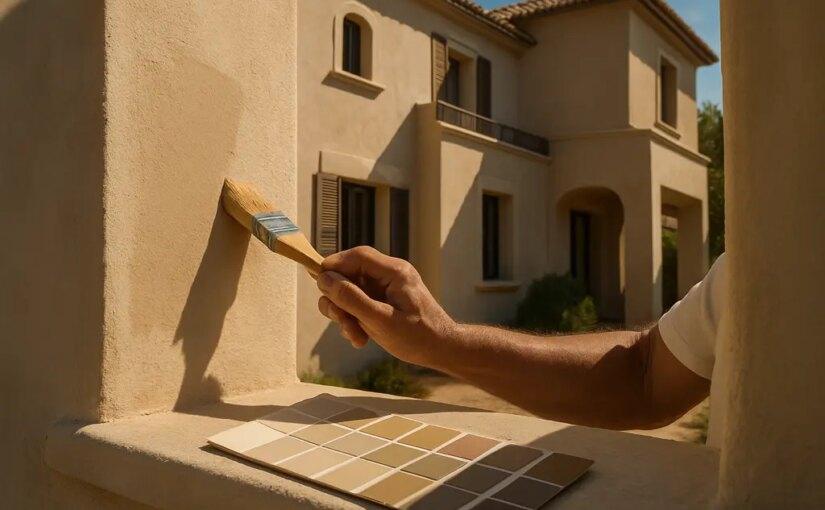
Warmer Neutral Colors are not just a taste shift for villa exteriors in 2026. They reflect a measurable move away from cool gray and stark white bodies toward beige, sand, taupe, stone, and softened off-white. For homeowners, the practical question is not whether beige is fashionable. It is whether a warmer exterior palette suits the building form, climate exposure, roof color, trim, masonry, planting, and maintenance plan.
As an architect, I treat exterior color as a building decision rather than a paint-store impulse. A villa facade has planes, shadows, thresholds, roof edges, doors, railings, and outdoor rooms. A warm neutral can calm those parts, but it can also expose poor prep work, incompatible undertones, or a trim contrast that looks sharper than expected in afternoon sun. The safest path is measured: study the data, test large samples, inspect the substrate, and know which parts of the project belong with a qualified contractor.
Why Warmer Neutral Colors Are Rising
The 2026 Data Behind The Shift
The clearest signal comes from homeowner renovation data. According to Houzz, beige became the most popular exterior wall color among renovating homeowners in its 2026 outdoor trends reporting, rising from 10% in 2024 to 24% in 2026; white fell from about 23% to 14%, and gray fell from 19% to 12% Houzz exterior trend data. That is a meaningful swing, not a minor preference change.
FacadeColorizer offers a different but useful view because it tracks simulated exterior selections from July 1, 2025, to June 2, 2026. Its barometer shows beige and sand warm neutrals at 9.7% of exterior body color selections, nearly level with mid and warm grays at 9.9%, while whites and off-whites still dominate at about 50.2% Facade Color Barometer 2026. That split matters. It suggests warm neutrals are gaining ground, but it does not mean every house should abandon white.
That does not mean Warmer Neutral Colors are a universal answer. The data supports a rise in preference, not a promise of better resale value, longer coating life, or lower maintenance. A warm exterior color still depends on paint quality, surface preparation, moisture control, sun exposure, and the condition of siding, stucco, masonry, or trim.
Why Villas Respond Well To Warm Neutrals
Villa exteriors often have larger wall fields, shaded openings, roof overhangs, terraces, and garden-facing walls. Warm beige, sand, greige, and taupe can reduce the glare that sometimes comes with very bright white. They can also sit more quietly beside stone, terracotta pavers, bronze hardware, timber gates, and clay roof tones.
Still, warmth must be handled with restraint. A beige body with a yellow undertone may clash with a cool gray roof. A taupe that looks refined on a sample card can read muddy beside reddish brick. A soft white trim can feel calm on one elevation and flat on another. Exterior color is judged under moving light, not under store lighting.
Reading Body Color, Trim, And Contrast
Where Warmer Neutral Colors Fit Best
Warmer Neutral Colors work best when they are part of a full exterior palette rather than a single paint pick. Start with the fixed elements: roof, stone, brick, concrete, existing windows, metal railings, and paving. These items are usually more expensive to change than paint. If they already lean warm, a sand or taupe body may feel settled. If they lean cool, a greige may be safer than a creamy beige.
Trim deserves the same discipline. Houzz reported that 69% of homeowners are choosing trim colors that contrast sharply with their wall color in 2026, with black leading at 39% trim preference and white trim falling to 19%. This supports the popularity of warm wall colors with darker trim, but homeowners should test contrast before committing. Black trim can sharpen a villa facade, yet it can also make thin trim look harsh or draw attention to uneven lines.
A practical approach is to view body, trim, door, and accent samples together. Do not test one beige alone on a back wall and assume it will work across the front elevation. Place samples near stone, gutters, window frames, and outdoor flooring. Check them in morning light, direct sun, shade, and early evening. If the house has multiple exposures, test on more than one side.
- Use large sample boards: Small chips hide undertones and do not show how color behaves across a broad wall.
- Compare against fixed materials: Roof, stone, brick, pavers, and window frames should guide the palette.
- Check contrast from the street: A trim color that looks balanced up close may appear too severe from a distance.
- Keep records: Note paint names, sheen, sample locations, and viewing times before making the final choice.
Planning A Safe Exterior Repaint

DIY Work Versus Hiring A Professional
Color selection is homeowner-friendly. Washing a low, accessible test area, taping sample boards, and comparing palettes are reasonable DIY tasks for many people. The risk rises when the project involves ladders, upper stories, damaged stucco, rotted trim, peeling coatings, unknown older paint layers, or work near electrical service lines. In those cases, hire a qualified painter or relevant trade professional rather than treating the project as a weekend experiment.
Do not let a color trend distract from building condition. Paint is not a repair for trapped moisture, failing flashing, cracked stucco, or deteriorated wood. A warmer shade may make the home look calmer, but it will not correct substrate problems. If the surface is chalking, bubbling, soft, or stained, ask a professional to diagnose the cause before repainting.
For villas with patios, courtyards, or pool terraces, the exterior body color should also be read from outdoor seating areas. A wall that looks gentle from the driveway may feel too bright beside an outdoor dining zone. If exterior color planning overlaps with terrace upgrades, this discussion of practical outdoor living spaces offers related planning cues for zoning, lighting, and material choices.
Budget And Resale Caution
Exterior repainting can be a substantial project, but the research provided here supports preference trends, not a guaranteed financial return. A warm neutral may align with 2026 taste, but value depends on many factors beyond color. If you are considering how property elements influence prospective buyers, Jimmy Guthrie Real Estate can provide insight; however, do not rely solely on color selection for selling success.
Budget decisions should prioritize surface preparation, durable coating systems, and professional labor where risk is high. It is usually wiser to choose a quieter warm neutral with excellent prep than a fashionable color applied over unresolved defects. Ask painters what is included in cleaning, scraping, repairs, primer, caulking, number of coats, and warranty terms. Avoid bids that make the surface condition sound irrelevant.
- DIY-friendly: Palette research, sample boards, low-risk visual testing, and documenting existing materials.
- Usually professional: Upper-story painting, extensive peeling, stucco cracks, rotted trim, specialty coatings, and work near hazards.
- Worth asking: Whether the proposed color needs a tinted primer, whether sheen will highlight defects, and how dark trim may affect maintenance expectations.
Warmer Neutral Colors In Practice
The practical value of Warmer Neutral Colors is their flexibility. Beige, sand, greige, taupe, and warm off-white can connect a villa to stone, timber, clay, planting, and shaded outdoor rooms without demanding attention. The strongest results come from quiet testing rather than fast selection.
For a safe decision, begin with the immovable materials, then choose the body color, then test trim and accent contrast. Keep the palette simple enough that maintenance remains manageable. If the home has visible defects, solve those before painting. If the work involves height, damaged materials, or uncertain existing coatings, bring in a professional. A warm neutral exterior is most convincing when the building behind the color is sound.